It has just turned Fall 2015, 3/4 of the year has passed, and we have seen many new developments in modern website design emerge.
The era of cluttered pages, information overloaded and packed with information are generally passing. The new focus has been on greater User Interface (UI) simplicity. Below is an overview of a handful of new hot trends we anticipate that we’ll be seeing more of as we enter 2016.
Since 2005, a decade or so ago, it was typical for various websites to basically have the same sort of general experience. There has always been diversity in color logos, images and typography, but aside from that most usually have the same menu across the top and/or down the side, and sub-menus contained in rectangles so that we can easily navigate the site structure.
Progressively, over time, UI web designers and layout artists have experimented and evolved designs. Each year new trends have emerged that have taken layouts and designs to new levels. Over the past year, we have seen some new trends emerge, which create dynamic & compelling user experiences.
The best web designers are now combining tried & tested elements with new creative techniques. The following trends and concepts, shown with screenshots, are presented individually, but these ideas can be combined in interesting & intriguing ways - and be the new layout methods for 2016.
A. Full Screen Video Splashes
While minimalistic designs are the new vogue, full screen videos and dynamic backgrounds are more often filling the void; a quick look from the visitor can be worth a hundreds of words, and quickly sets the intended mode of the website experience.
Advances in HTML5 are enabling brands to use videos in a way that wasn’t previously possible. Here is how Apple has used this to market its new Apple Watch.
read_more
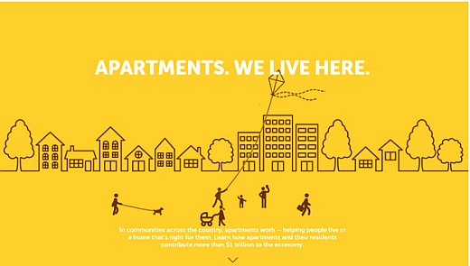
As another example, WeAreApartments.com uses a full-screen interactive infographic to draw their attention to their service, offering to engage the prospective client.
As shown below, their interactive design represents a community atmosphere with its residents enjoying walking their dogs, strolling their babies and flying kites. This builds the impression that their service will help find the right apartment for the reader.
Full screens can resemble the look of a television screen or an open-magazine, often using a scrolling effect to present itself.
The idea is to provide utter clarity for the user. It can be positively a stunning/distractionless effect with a clean design and absence of extra “chrome” bells & whistles.
This bold background does not distract from the foreground:
This one is maybe a bit too garish, but this layout is still user-friendly although bold:
B. Split screens
The split screen layout features a vertical divide that presents two different screens.
The business has two different products or services to promote. The page split allows visitors to select one of the two.
A restaurant, for example, may want to express its brand on one side with scrolling examples of its’ menu items on the other side.
Below are two perfect examples of split-screen design;
Peugeot cars showcases its current slogan with a split screen:
C. No “chrome”
Chrome is defined as ny embellishments that are not absolutely necessary to the basic function of a website. Many layout designers currently believe that extra "chrome" distracts the visitor, when focus should be only on the main message of the page – the product or service representing these things.
By minimizing all of these distractions, a nice clean effect is presented. No borders, headers or footers pull the visitors eyes away from the desired focal point(s). Here are two examples of sites with "no chrome":
You can still have menus, information, and an image gallery without distracting chrome, as Braun proves:
D. “Block grids”
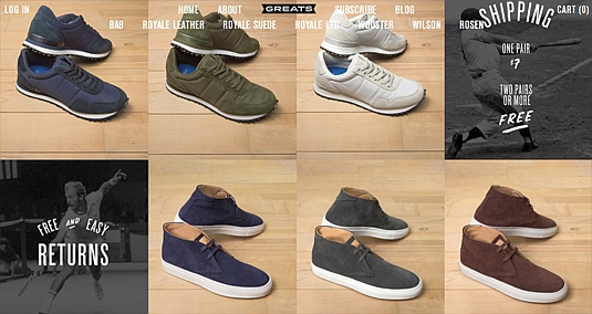
This design technique divides a page into several symmetrical or asymmetrical blocks. These blocks are usually sized relative to importance of the subject matter being displayed. These can be used on pages other than the home page. Often the grids are designed to be flexible or ‘responsive’, so as to re-size or re-orient to fit a desktop, laptop screen, or reduced structured to fit screens of mobile devices.
The first example below is for a company that markets men’s shoes.
Same-sized blocks are used because their styles of shoes are of equal importance:
 This below example is for a music school. Unequal emphasis is used.
The largest block shows the director; smaller blocks for the student pictures:
E. Interactive Infographics
Infographics became popular in 2014. In 2015 they continued to be. Merging Dynamic web interactivity with information maximizes the fun of the website. Visitors enjoy a more engaging experience; the interactivity promotes better storytelling. Things are revealed piecemeal, and for extra fun the storyboard layout can include extra suprises known as “Easter eggs”.
FutureofCarSharing.com is a good example. Its’ horizontal scrolling layout supports a “timeline” presentation, while the interactive components engage the visitor.
F. Ghost Buttons & Line Icons
About the time of the release of Apple iOS 7, along came a rise in “line iconography” or “ghost buttons”; which are transparent visuals and buttons outlined with a thin, usually white, line. The effect is a simpler aesthetic; allowing icons and buttons to be larger, yet more transparent to usually full-screen photography, illustrations or other imagery.
Another example using this technique:
If you have any questions regarding your website or design ideas, we’d love to hear from you. Just write us at support @ 4goodhosting.com


