


 When this article first appeared on the 4GoodHosting blog at the end of 2019, it offered six quick tips: keep menus slim, use descriptive labels, be careful with dropdowns, put important items first and last, include search, and link to your blog. Most of that advice was reasonable for its time. Some of it was never quite right, and all of it treated navigation as a question of menu design.
That is too narrow for a modern online store. Navigation on an e-commerce site does three jobs at once, for three very different audiences.
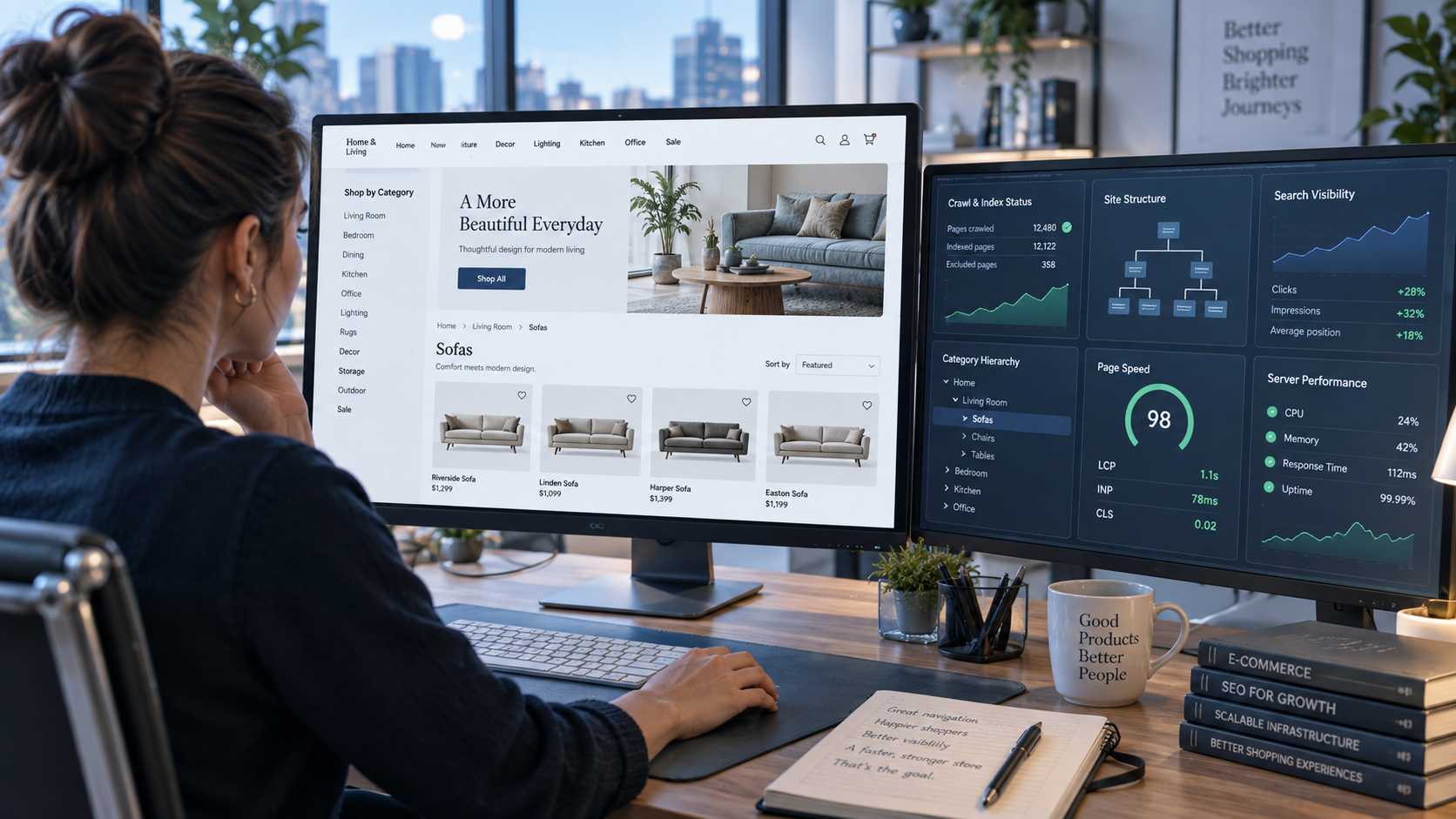
It helps shoppers find the product they came for, or discover one they did not know they wanted. It tells search engines which pages matter and how they relate to each other, which shapes what gets crawled, indexed and ranked. And every link, filter and search box it exposes becomes a request your server has to answer, whether it comes from a customer, Googlebot or a scraper working through every filter combination you offer.
A store whose navigation serves only one of those audiences will struggle. A beautiful mega menu that search engines cannot follow leaves products undiscovered. Filters that generate millions of crawlable URLs can bury your real product pages and load your server with traffic that never buys anything. A technically perfect structure that uses labels nobody searches for will not sell.
This guide rebuilds the topic around all three jobs. It covers how to design a category structure, menus, filters, search and breadcrumbs that customers can use; how to make that structure clear to Google; and how to keep it from quietly overloading your hosting.
The short version
If you only have five minutes, these are the points that matter most.
- Design the category structure before the menu. The menu is only a view of your taxonomy. If the taxonomy uses the wrong words or the wrong groupings, no menu design will fix it.
- Use real links. Google finds products by following <a href> links from menus to categories to products. Navigation built from JavaScript click handlers, or products reachable only through search, may never be found.
- Treat filters as your biggest SEO and hosting risk. Faceted navigation can create an almost unlimited number of URLs. Decide deliberately which filter pages deserve to be indexed and keep crawlers out of the rest.
- Make site search good, then learn from it. Shoppers who search are telling you, in their own words, what your navigation failed to show them.
- Build for keyboards, thumbs and screen readers. Accessible navigation is better navigation for everyone, and for larger organisations in Ontario it is a legal requirement.
- If you sell into Quebec, plan for French navigation. Menus, categories and filters are part of your commercial content.
- Watch what navigation costs your server. Uncached filter and search pages are expensive to generate. Your hosting has to be sized for the traffic your navigation invites, not just the traffic you expect from customers.
What "navigation" means on an online store
On a brochure website, navigation is mostly a menu. On a store, it is a system of connected parts, each doing a different job. It helps to name them, because problems usually sit in one specific part.
| Component | What it does for shoppers | What it tells search engines | What it costs the server |
| Category taxonomy | Groups products the way customers think about them | Defines the site's main hierarchy and topical sections | Low; category pages cache well |
| Main menu | Gives a fast route to top categories | Heavy internal linking to the pages you list, on every page | Low, unless the menu is bloated with scripts and markup |
| Faceted filters | Narrows a category by size, colour, price, brand and so on | Can create huge numbers of near-duplicate URLs | High; filtered pages are often generated fresh for each request |
| Sorting | Reorders results by price, popularity or date | Sort parameters create yet more URL variations | Moderate to high |
| Site search | Lets people type what they want | Search results pages generally should not be crawled or indexed | High; each query can hit the database |
| Breadcrumbs | Shows where the shopper is and offers a way back up | Reinforces hierarchy; can appear in search results | Negligible |
| Pagination | Splits long category lists into pages | Determines whether products deep in a list are discoverable | Moderate |
| Contextual links | "Related products", "Complete the look", buying guides | Distributes importance to specific products | Low to moderate |
| Footer and utility links | Shipping, returns, account, help, language | Links to trust and policy pages sitewide | Negligible |
Keep this table in mind as you read. Most navigation advice focuses on the first two rows. Most navigation problems on established stores come from rows three, four and five.
Start with the taxonomy, not the menu
The single most useful thing you can do for a store's navigation happens before anyone opens a design tool: deciding how your products are grouped and what those groups are called.
Use the words customers use
Stores are usually organised the way the business thinks about its inventory: by supplier, by internal product code, by warehouse section or by the category names in a wholesale catalogue. Customers think in terms of problems, occasions and the words they would type into a search box.
A kitchen retailer might file products under "Cutlery", "Hollowware" and "Small Electrics" because that is how its suppliers invoice. Customers are looking for "knives", "serving dishes" and "coffee makers". An outdoor store might have a category called "Technical Shells" when most shoppers search for "rain jackets".
There are three practical ways to find the right words.
Read your site search logs. The terms people type into your search box are the most direct evidence you have of how customers describe what they want. If hundreds of people search for "rain jacket" and your category is called "Technical Shells", the fix is obvious.
Look at the search queries that bring people to your site. Google Search Console shows the terms your pages appear for. It will not show everything, but it reliably reveals the vocabulary your market uses.
Test the structure with real people. Two inexpensive research methods are worth knowing. In a card sort, participants group product names into categories that make sense to them, which shows you how customers would organise your catalogue. In a tree test, participants try to find specific products using only a text version of your proposed category structure, with no design to help them. Tree testing is especially good at exposing labels that seem clear to your team and confuse everyone else.
Canadian vocabulary is not American vocabulary
Canadian stores often inherit themes, plugins and category templates built for the US market, and the default labels come with them. Canadians write "colour" and "jewellery", shop for "toques" rather than "beanies", and may search for "runners" as well as "sneakers". Size and measurement conventions vary by category.
None of this needs to be overdone, and many Canadians use both terms. But your navigation labels, filter names and search synonyms should reflect how your actual customers write. If you serve customers in both official languages, the same thinking applies in French.
Depth versus breadth
A taxonomy can be wide and shallow, with many top-level categories and few levels beneath, or narrow and deep, with few top-level groups and several levels of subcategory. Neither is correct in general. What matters is how quickly a shopper can recognise the right path at each step.
You may have heard of a "three-click rule", the idea that every product should be reachable within three clicks. It is a useful instinct and a poor rule. Shoppers do not abandon a site because they clicked a fourth time; they abandon it when they lose confidence that they are heading in the right direction. A clear path of four obvious steps beats a confusing path of two.
Depth does matter for search engines, though for a slightly different reason. Google says it can use signals such as how many links it has to follow to reach a page, and how many internal links point to it, to judge how important that page is relative to the rest of your site. Products buried many levels deep, linked from only one paginated list, are sending a weak signal. Important categories and best-selling products should be reachable in a few steps from the home page.
One home, many paths
Many products legitimately belong in more than one place. A waterproof hiking boot belongs in "Hiking Boots", "Waterproof Footwear" and perhaps "Gifts for Hikers". Shoppers should be able to find it through any of those routes.
What you want to avoid is the product existing at several different URLs depending on the path used to reach it, such as /hiking-boots/trailmaster-gtx/ and /gifts/trailmaster-gtx/. That creates duplicate pages competing with each other. Most modern platforms handle this correctly by giving each product a single canonical URL regardless of which category linked to it. It is worth checking that yours does, particularly if your store was migrated from an older platform or uses a custom theme.
Category pages are landing pages
For many searches, a category page is exactly what a shopper wants: "men's winter boots" is better answered by a well-organised list of men's winter boots than by any single product. That makes your category pages some of the most valuable pages on your site for search.
Treat them that way. A category page that is nothing but a product grid with a heading gives search engines very little to work with, and gives shoppers very little help choosing. A short, genuinely useful introduction above or below the grid helps both. Explain what distinguishes the options, which features matter, and who each subcategory suits. Our guide to landing page SEO covers the balance between conversion design and indexable content in more depth, and the same principles apply to category pages.
Designing the main menu
With a sound taxonomy in place, the main menu becomes a much easier problem. Its job is to give shoppers a fast, recognisable route into your most important categories from any page.
How many items should a menu have?
The original version of this article recommended no more than seven menu items. That number is often traced to a famous psychology paper about the limits of short-term memory, but that research was about how many items people can hold in their heads, not how many they can scan on a screen. Menus are visible; nobody has to memorise them.
The right number of top-level items is the number your taxonomy needs, presented so that each is quick to scan and clearly distinct from the others. A specialist store might need four. A general merchandise store might need twelve. The failure mode is not "too many items" as such. It is items that overlap ("Deals", "Sale" and "Clearance" side by side), items that are vague, and menus so long they wrap onto two lines or push important categories out of sight on smaller screens.
Labels that say what is behind them
Every menu label is a promise about what the shopper will find if they click. Specific labels keep that promise; vague ones make shoppers guess.
"Shop", "Products", "Collections" and "Solutions" tell a visitor almost nothing. "Women's Boots", "Camping Stoves" and "Gift Cards" tell them exactly where they are going. Clever brand language for categories ("The Trail Edit") can work as a secondary feature, but it should not replace plain category names in the main menu.
The original article also suggested that descriptive menu labels would be "indexed" and help search engines. The real mechanism is a little different. The text of a link, its anchor text, helps search engines understand what the linked page is about. A menu that links to your boots category with the words "Women's Boots" gives Google a clearer signal than one that links to it with the word "Shop". The benefit is real, but it comes from clarity, not from stuffing keywords into labels.
Mega menus done well
Stores with large catalogues often use mega menus, the wide panels that open to show several columns of subcategories at once. Done well, they let shoppers see the shape of a large catalogue in a single glance. Done badly, they are one of the most frustrating parts of a store.
The common problems are predictable:
- Panels that open on accidental hover. A shopper moving the mouse to the search box passes over the menu and a large panel flashes open, covering the page. A short delay before opening, and tolerance for diagonal mouse movement, fix most of this.
- Menus that only work with a mouse. If a panel opens only on hover, keyboard users and many touch-screen users cannot use it. Menus should open on click or tap as well, and be fully operable from a keyboard.
- Panels that hide the top-level categories. Every top-level category should also be a real, clickable link to its own page, not just a trigger for a panel.
- Too much in one panel. A mega menu with sixty links in eight columns is a site map, not a menu. Show the subcategories that most shoppers need and let the category page handle the rest.
Mobile menus
On phones, most stores collapse the menu behind an icon, usually the three-line "hamburger". That saves space, but it also hides your entire category structure behind a tap many visitors never make.
A few practices make mobile navigation noticeably better. Show your most important categories directly on the home page, rather than relying on the hidden menu to surface them. Make search visible at the top of the page rather than hiding it behind another icon. Keep the menu's levels shallow, with a clear "back" control at each level. Make touch targets large enough to tap accurately; the current web accessibility guidelines, WCAG 2.2, set a minimum target size of 24 by 24 CSS pixels for most controls, and larger is easier. Our guide to mobile-first indexing explains why the mobile version of your navigation is also the version Google primarily evaluates.
Utility navigation
Alongside product categories, every store needs a set of utility links: account, cart, order tracking, help, shipping information and returns. For Canadian stores, a few items in this area deserve particular attention.
Shoppers want to know early whether you ship to their province or territory, how much it costs and how long it takes, and whether prices are in Canadian dollars. Making shipping and returns information one click away from every page answers questions that otherwise lead to abandoned carts. If you serve customers in both English and French, the language switcher belongs here too, and it should be easy to find without scrolling.
Faceted navigation: the most valuable and most dangerous part
Faceted navigation is the set of filters that let shoppers narrow a category: by size, colour, brand, price, material, rating and whatever else matters for your products. For large catalogues, it is often more important than the menu. It is also where the three audiences of navigation come into the most direct conflict.
What shoppers need from filters
Good filters are specific to the category. Shoppers looking at boots want to filter by size, width and waterproofing; shoppers looking at tents want capacity, season and weight. A single generic set of filters applied to every category is a common and avoidable weakness.
Beyond relevance, a few details make filters much easier to use:
- Show how many products match each option, so shoppers are not led into empty results.
- Hide or disable options that would return nothing, rather than letting shoppers discover dead ends.
- Show applied filters clearly, usually as removable "chips" above the results, with a single control to clear them all.
- Keep filter choices when the shopper changes sort order or pages through results.
- On mobile, put filters behind a clearly labelled button and show the number of results before the shopper applies them.
Why filters create a near-infinite number of URLs
Most filter systems work by adding parameters to the page address. A category page at /boots/ becomes /boots/?colour=black when one filter is applied, then /boots/?colour=black&size=9 when a second is added, and so on.
The arithmetic gets out of hand quickly. Suppose a boots category has 10 colours, 15 sizes, 8 brands, 4 widths and 5 price bands. If shoppers can select any single value from each filter, or leave it unselected, there are already more than 47,000 possible combinations for that one category. Allow multiple values per filter, add sort orders and pagination, and allow parameters to appear in any order, and the number of distinct URLs becomes effectively unlimited. Many of those pages are nearly identical; many show the same handful of products; many show nothing at all.
Google describes exactly this problem in its guidance on faceted navigation. It notes that parameter-based filters can generate infinite URL spaces, and that this harms a site in two ways. Crawlers spend large amounts of time on filter URLs before they can tell those URLs are useless, which is known as overcrawling. And because crawling time is being spent on filter URLs, new and genuinely useful pages are discovered more slowly.
Decide which filter pages deserve to exist in search
Not every filter page is useless. Some combinations match real, sizeable search demand. "Women's waterproof hiking boots" is something people search for, and a page listing exactly those products is a good answer. "Black size 9 wide boots under $150 sorted by newest" is not a search anyone makes.
The practical approach is to decide deliberately:
- Identify filter combinations with genuine search demand, using keyword research and your own search data.
- Turn those into proper category or subcategory pages, with a clean URL, a unique heading and introduction, and links from your navigation. At that point they are no longer "filter pages" at all; they are part of your taxonomy.
- Keep every other filter combination out of the crawl, so that search engines spend their time on your products and real categories.
This is the difference between a store whose filter pages dilute its visibility and one whose best filter pages become some of its strongest landing pages.
How to keep crawlers out of the rest
Google's faceted navigation guidance sets out the options, and it is worth following closely because some popular methods are weaker than people assume.
Block filter URLs in robots.txt. If you do not need filtered pages to appear in search, Google's primary recommendation is to prevent crawling of them. A robots.txt rule can disallow URLs containing your filter parameters while leaving individual product pages and the unfiltered category page crawlable. Google's guidance puts this bluntly: there is often no good reason to allow crawling of filtered items, because it consumes server resources for little or no benefit. A simplified example for a store whose filters use colour, size and brand parameters:
User-agent: *
Disallow: /*?*colour=
Disallow: /*?*size=
Disallow: /*?*brand=
The exact rules depend on how your platform builds filter URLs, and a mistaken rule can block pages you need, so test changes carefully before relying on them.
Or put filters in the URL fragment. Google generally ignores the part of a URL after a # for crawling and indexing. If your filter system records selections as /boots/#colour=black&size=9, crawlers will treat every filtered view as the same page. This is common in JavaScript-driven filter interfaces, though it means filtered views cannot be indexed at all.
Canonical tags and nofollow are weaker tools. Pointing a filtered page's rel="canonical" at the unfiltered category, or adding rel="nofollow" to filter links, can help. Google describes both as generally less effective in the long term. A canonical tag is a hint that may reduce crawling over time, not an instruction; and nofollow only works if every link to a given filter URL carries it.
If you do want some filtered pages crawled and indexed, Google recommends a few rules that reduce waste:
- Use the standard & character to separate parameters, not commas, semicolons or brackets.
- If filters are encoded in the URL path, such as /boots/black/size-9/, keep them in a consistent order and do not allow duplicates.
- Return a proper 404 Not Found status for filter combinations that match no products, rather than an empty page with a 200 OK status or a redirect to a generic error page.
That last point is surprisingly often missed. A filter combination that returns "No products found" with a normal success status looks to search engines like a real page with thin content. Thousands of them look like a low-quality site.
The server cost nobody budgets for
This is the part of faceted navigation that most e-commerce guides skip, and it is where hosting enters the picture.
A product page or an unfiltered category page is usually easy for a server to cache. The same page is requested many times, so the server can build it once and serve a stored copy. A filtered page is different. Each combination is requested rarely, often only once, so it is usually generated fresh: the store's software runs database queries to find matching products, counts results for every filter option, builds the page and sends it. Multiply that by thousands of filter URLs being requested by crawlers, and a store can spend much of its server capacity building pages nobody will ever buy from.
Google says as much in its own documentation, noting that crawling faceted URLs tends to cost sites large amounts of computing resources because of the sheer number of URLs and the operations needed to render them. And Googlebot is only one visitor. Other search engines, SEO tools, price-monitoring services and scrapers crawl filter URLs too, and many of them are far less considerate. Our article on responsible web scraping looks at the same traffic from the other side.
The symptoms are recognisable once you know to look for them:
- The store slows down at times when real customer traffic is not unusually high.
- Server logs show large numbers of requests for URLs with long strings of filter parameters.
- Search Console's crawl stats show high crawl volume but little of it reaching your products.
- Search Console's indexing reports list large numbers of parameter URLs as crawled but not indexed.
Controlling filter crawling is therefore both an SEO fix and a capacity fix. It is one of the rare changes that can make a store faster and improve how its important pages are crawled at the same time.
Site search: navigation for people who already know what they want
Browsing works for shoppers who are exploring. Shoppers who know exactly what they want, down to a brand, model or part number, will usually go straight to the search box. On many stores, those searchers are among the most valuable visitors, because they arrive with clear intent.
Search does not replace linked navigation
One point from Google's e-commerce guidance is worth stating early, because it catches out many stores. Googlebot generally does not type queries into search boxes while crawling. If some of your products can be reached only through site search, and not through category pages or other links, Google may never find them by crawling.
Every product you want indexed should be linked from at least one category page, and ideally from more than one place. Where that is not practical, for very large catalogues or products that change constantly, Google recommends an XML sitemap or a product feed so that those pages can still be discovered. Search should be an extra route into the catalogue, never the only one.
What good store search does
Store search has a harder job than it looks. Shoppers misspell product names, use different words from your catalogue, search by SKU or model number, and type fragments. A search box that only matches exact product titles fails a large share of them.
Good store search typically does the following:
- Tolerates typos, so "hikng boots" still finds hiking boots.
- Understands synonyms, so "toque" finds beanies and "runners" finds running shoes, and Canadian and American spellings both work.
- Matches product codes and model numbers as well as names.
- Handles both official languages if you sell to French-speaking customers.
- Shows useful suggestions as people type, including categories as well as products.
- Offers filters on the results page, just as a category page would.
- Never leaves a dead end. A "no results" page should suggest alternative spellings, popular categories and a way to contact you, rather than simply stating that nothing was found.
Your search log is free customer research
Every search typed into your store is a customer telling you, in their own words, what they want. Reviewing that log regularly is one of the most useful habits a store owner can have.
Look in particular for three patterns. Searches with no results show products you do not carry, synonyms you are missing or spelling variations you need to handle. Frequent searches for things that are in your menu suggest your navigation labels or structure are not doing their job. Searches for information such as "shipping", "returns" or "size chart" show which help content people cannot find.
Search, crawlers and server load
Site search has hosting implications similar to faceted navigation. Each search is usually generated fresh, because the combinations are endless and rarely repeated. On many platforms, particularly stores using a database's built-in text search, a single query can be relatively expensive, and features such as live suggestions multiply the number of requests, because every keystroke may trigger a new one.
Three practices keep this under control. First, keep search results pages out of the crawl. They are typically thin, duplicative and endless, and there is rarely any benefit to having them indexed. Search results are usually excluded in robots.txt, and many platforms add noindex to them by default. Second, throttle or delay live suggestions so they are not requested on every single keystroke. Third, for larger catalogues, consider a dedicated search service or search index rather than relying on direct database queries. If your store is slowing under search load, our article on how slow database queries hurt WordPress performance explains where that time goes.
Breadcrumbs, pagination and the links that carry weight
Breadcrumbs
Breadcrumbs are the small trail of links near the top of a page, such as Home › Footwear › Hiking Boots › Trailmaster GTX, that show a shopper where they are and let them step back up the hierarchy with one click. On a store they are especially useful for shoppers who arrive directly on a product page from a search result, social post or advertisement, and have not seen your menu at all.
Breadcrumbs also help search engines understand the structure of your site, and you can describe them explicitly with BreadcrumbList structured data, which Google supports. One recent change is worth knowing about. In January 2025, Google stopped showing breadcrumbs in mobile search results, displaying only the domain in the visible URL on phones. Breadcrumbs still appear in desktop results, and Google continues to support breadcrumb markup. The on-page breadcrumb remains just as useful for shoppers as it always was.
A breadcrumb should reflect a product's main place in the hierarchy, not the particular path a shopper happened to take. A product reached through a "Gifts" collection should normally still show its home category in the breadcrumb, so that the trail is consistent for every visitor and every crawler.
Pagination, infinite scroll and "load more"
Long categories have to be split up somehow. The three common approaches are numbered pages, infinite scroll, where more products appear automatically as the shopper scrolls, and a "load more" button.
All three can work for shoppers. For search engines, the important point is that products deep in a category must still be reachable through ordinary links. Google's guidance on pagination and incremental loading recommends giving each page of results its own URL and linking between them with normal <a href> links. An infinite scroll implemented purely with JavaScript, with no underlying paginated URLs, can leave everything after the first screen of products invisible to crawlers.
Two other details are commonly confused. Google stopped using rel="next" and rel="prev" links as an indexing signal some years ago, so adding them will not help; ordinary links between pages will. And the second and later pages of a category should not usually carry a canonical tag pointing at page one, because that tells Google the later pages are duplicates of the first, which they are not.
Link to what sells
Google's e-commerce guidance makes a point that is simple but often overlooked. Google infers the relative importance of pages largely from how they are linked within your site: in general, the more internal links a page has, the more important it appears. It suggests linking to best-selling products from your home page and from other content such as blog posts and newsletters.
In practice, that means your navigation should not treat every product equally. Featured categories on the home page, "best sellers" sections, links from buying guides and "related products" modules all concentrate attention, for shoppers and for search engines, on the pages that matter most commercially. Our guide to product page SEO covers what to do on those pages once shoppers and crawlers arrive.
Crawlable navigation: the technical rules
Much of what makes navigation readable to search engines comes down to a few technical rules that are easy to break without noticing, especially with modern JavaScript themes and apps.
Use real links. Google's guidance is explicit: use <a href> elements for links to other pages, and do not rely on JavaScript events attached to other elements for navigation. A menu item built as a <div> or <span> that responds to a click handler may work perfectly for shoppers and be invisible to crawlers.
Put the menu in the HTML. Navigation that is present in the page's HTML is straightforward for crawlers to read. Navigation injected later by JavaScript can often still be processed, because Google renders pages, but rendering is an extra step, and not every search engine or crawler does it. The safest approach is for menu links to exist in the initial HTML, even if they are visually hidden until opened.
Hidden is fine; missing is not. Links inside a collapsed menu or a closed mega-menu panel are still links, provided they exist in the page. What matters is that the <a href> elements are there, not whether they are visible at the moment the page loads.
Keep URLs clean and stable. Category and product URLs should be readable, consistent and permanent. Changing them breaks bookmarks, external links and search visibility, and every change needs a redirect.
Give every page a way in. Orphan pages, products or categories with no internal links pointing to them, are hard for crawlers to find and are treated as unimportant when found. A regular crawl of your own site with an SEO crawling tool will reveal them.
Navigation performance: menus that don't slow the store down
Navigation appears on every page of a store, so its performance cost is paid on every page view. Three issues come up repeatedly.
Oversized menus
Mega menus can contain hundreds of links. Some themes then output the whole menu twice, once for desktop and once for mobile, and hide whichever is not in use. The result is a large amount of markup on every page, which the browser has to download, parse and lay out, even though the shopper sees only a fraction of it. Lighthouse and similar tools flag this as an excessive page size or a very large number of page elements. Trimming menu depth, and using a single responsive menu rather than two copies, reduces the cost on every page.
Slow interactions
Since March 2024, Google's Core Web Vitals have measured responsiveness with a metric called Interaction to Next Paint, or INP. It captures how quickly a page responds visually when someone clicks, taps or types, across the whole visit rather than only the first interaction. A response within 200 milliseconds is considered good.
Navigation is a frequent source of poor INP. Opening a heavy mega menu, applying a filter that triggers a lot of JavaScript, or typing into a search box that fires a request and redraws suggestions on every keystroke can all delay the page's response. Filters are a particular risk, because applying one often means waiting for the server to generate a new set of results. Our guide to Core Web Vitals and SEO explains how these metrics are measured and what counts as a pass.
Server response time
Every time a shopper opens a category, applies a filter or runs a search, they wait for the server to respond before anything appears. On a slow server, even a perfectly designed navigation feels sluggish, because every step through the catalogue carries a delay. This is where navigation and hosting meet most directly, and it is covered in more detail below.
Accessible navigation, and the Canadian legal context
Accessible navigation means navigation that works for people who use a keyboard instead of a mouse, rely on a screen reader, magnify the screen, or have limited dexterity. It also tends to be better navigation for everyone, including shoppers on phones, in bright sunlight or in a hurry.
What accessible navigation requires
The Web Content Accessibility Guidelines, WCAG, are the international standard. The current version, WCAG 2.2, was published by the W3C in October 2023. Several of its success criteria apply directly to store navigation:
- Keyboard access. Every menu, panel, filter and search control must be usable with a keyboard alone, with a visible indicator showing where focus is.
- A way to skip repeated content. A "skip to main content" link lets keyboard and screen-reader users bypass a long menu on every page.
- Multiple ways to find pages. WCAG expects more than one route to content, such as a menu plus search, or a menu plus a site map.
- Consistent navigation. Menus should appear in the same place and order across the site.
- Focus that is not hidden. WCAG 2.2 adds a requirement that the element with keyboard focus is not entirely hidden, for example behind a sticky header or cookie banner, which is a common problem on stores with fixed headers.
- Target size. WCAG 2.2 also sets a minimum size of 24 by 24 CSS pixels for most click and tap targets, or equivalent spacing around smaller ones.
- Proper semantics. Menus should be marked up so assistive technology can announce them correctly, for example as a navigation region, with buttons that report whether their panel is expanded or collapsed. The W3C's ARIA Authoring Practices Guide includes a navigation menu pattern that describes one reliable way to do this.
Filters need particular care. Checkboxes and ranges should have proper labels, the number of results should be announced when filters change, and applying a filter should not move keyboard focus somewhere unexpected.
Ontario's AODA
For many Canadian stores, accessibility is also a legal matter. Under Ontario's Accessibility for Ontarians with Disabilities Act and its Integrated Accessibility Standards Regulation (O. Reg. 191/11), large organisations, meaning private and non-profit organisations with 50 or more employees in Ontario, along with designated public sector organisations, have been required since 1 January 2021 to make their public websites and web content conform to WCAG 2.0 Level AA, with limited exceptions for live captions and pre-recorded audio description.
Smaller businesses are not covered by that website requirement, and other provinces have their own accessibility frameworks at different stages. But the direction is clear, and meeting the standard is good practice regardless of size. Accessibility obligations depend on your organisation's specific circumstances, so confirm yours with a qualified advisor.
Bilingual navigation for stores that sell into Quebec
If your store sells to consumers in Quebec, French is not optional. The Charter of the French Language requires commercial publications, such as catalogues and brochures, to be available in French, and the Office québécois de la langue française has long treated commercial websites as falling within that requirement. The Charter's 2022 amendments, often called Bill 96, strengthened enforcement and increased penalties.
For navigation, the practical consequence is that the French version of your store has to be a real, complete version, not a translated home page with English menus underneath. Plan for the following:
- Menus, category names, filter labels and filter values in French, including sizes, colours and materials.
- A language switcher that keeps the shopper's place, so switching languages on a product page leads to the same product in French rather than back to the home page.
- French URLs or a clear language directory, such as /fr/, with hreflang annotations connecting each English page to its French equivalent.
- Search that works in French, including French synonyms and accented and unaccented spellings.
- Language labels in words, not flags. A Canadian or French flag is an ambiguous way to signal a language choice. "Français" and "English" are clear.
The rules on language in commerce are detailed and have changed recently, so if Quebec is a meaningful market for you, have your approach reviewed by counsel familiar with the Charter.
How hosting shapes navigation
Most navigation guides stop at design and SEO. For a store, that leaves out the part that decides whether a well-designed navigation actually feels fast: the infrastructure underneath it.
Navigation creates load you do not see in your analytics
Your analytics tool counts shoppers. It usually does not count crawlers, SEO tools, uptime monitors, price trackers and scrapers, all of which follow your navigation too. On a store with extensive faceted navigation and search, that automated traffic can account for a large share of requests, and those requests are often for exactly the pages that are most expensive to build.
This is why a store can feel slow even when its visitor numbers look modest. The server is sized for the customers the owner can see, while spending much of its effort on visitors the owner cannot.
What to look for in e-commerce hosting
If you are asking what the best hosting in Canada for e-commerce websites looks like, the honest answer is that it depends on your catalogue, your traffic and how your navigation is built. A small store with a few dozen products and simple categories has very different needs from one with thousands of products and deep filtering. The questions below matter more than any single label.
- Is there enough processing power and memory for uncached pages? Filtered categories, search results, carts and checkout cannot usually be cached. Performance under those conditions, not on a cached home page, is what shoppers experience while navigating.
- How is caching handled? Page caching for categories and products, object caching for repeated database queries, and correct rules for what must never be cached, such as carts and accounts, all shape how fast navigation feels.
- Is the database fast and well resourced? Filters and search lean heavily on it.
- Can you control bot traffic? Rate limiting, firewall rules and the ability to block abusive crawlers protect capacity for real customers.
- Can the plan grow with the catalogue? Stores that outgrow shared hosting usually do so because of uncached, database-heavy traffic, which is exactly what rich navigation produces. A VPS or dedicated server gives you dedicated resources and control over caching and server configuration.
- Where are the servers? For shoppers in Canada, servers in Canada keep the round trip short. Every category click, filter change and search request involves at least one trip to the server, so latency is paid many times in a single shopping session. 4GoodHosting operates Canadian data centres in Vancouver and Toronto.
- Is checkout covered properly? Navigation ends at the cart. If you take card payments, your hosting environment is part of your PCI DSS responsibilities, and our PCI compliance page covers that side.
For a fuller look at platform and resource choices, our guide to e-commerce hosting in Canada goes deeper on high-traffic WooCommerce stores, and our Black Friday readiness guide covers preparing navigation-heavy pages for peak load.
Measuring whether your navigation works
Navigation changes should be judged by evidence, not taste. A handful of measurements will tell you most of what you need to know.
In your analytics:
- Site search usage and exits. How many sessions use search, which terms are most common, and how often searchers leave from the results page.
- Zero-result searches. The single most actionable search report.
- Navigation clicks. Tracking clicks on menu items and filters shows which parts of your navigation are used and which are ignored.
- Paths to purchase. Path exploration reports show the sequences of pages that lead to orders, and where shoppers drop out.
- Category page engagement. Low engagement on a category page can indicate the wrong products, the wrong filters or a misleading menu label.
In Google Search Console:
- Page indexing report. Large numbers of parameter URLs listed as crawled but not indexed, or discovered but not indexed, point to faceted navigation leaking into the crawl.
- Crawl stats. The crawl stats report shows how many requests Googlebot makes, how quickly your server responds, and whether host problems are occurring. Rising response times during crawl spikes are a warning sign.
- Breadcrumb and product structured data reports. These show whether your markup is being read correctly.
In your server logs:
- Requests by bot. How much of your traffic comes from crawlers, and which ones.
- Requests by URL pattern. How many requests go to filter, sort and search URLs compared with products and categories.
- Response times for uncached pages. How long filtered categories and searches take to generate under load.
If you do not have access to your server logs, ask your host. They are often the clearest evidence of how much of your capacity your navigation is consuming.
Three stores, three navigation problems
Here is how these issues play out for three common types of Canadian store. The businesses are illustrative, but the patterns are typical.
A small specialist store
A Saskatoon business sells around 300 products for home coffee brewing on a WooCommerce site on shared hosting. The owner redesigned the menu last year and is unsure why sales from search have not improved.
Tree testing with a few customers shows that the category "Brewing Apparatus" confuses almost everyone, who look for "coffee makers" or "pour-over". The search log confirms it. Renaming categories to match customer vocabulary, adding a short guide to each category page and linking best sellers from the home page are the highest-value changes. With a small catalogue and few filters, crawl and server load are not a concern yet.
A growing fashion retailer
A Toronto clothing store has about 6,000 products and a filter panel offering size, colour, brand, fit, material, price and sort order on every category. Its site slows in the evenings even when traffic is ordinary, and Search Console lists tens of thousands of parameter URLs as crawled but not indexed.
The logs show crawlers of every kind working through filter combinations. The fix has three parts. First, a small set of high-demand combinations, such as "women's wool coats" and "men's slim-fit chinos", become proper category pages linked from the menu. Second, the remaining filter parameters are blocked from crawling in robots.txt, and empty combinations return 404. Third, the store moves from shared hosting to a VPS with object caching and rate limiting for aggressive bots. The evening slowdowns stop, and crawling shifts towards products and real categories.
A national store selling into Quebec
A specialty food retailer based in Gatineau ships across Canada and has a large customer base in Quebec. Its French site was built by translating the home page and product descriptions, but menus, filter labels and checkout remained in English.
The store rebuilds its French version as a complete parallel site under /fr/, with translated category names, filter values and URLs, hreflang annotations, a language switcher that preserves the shopper's page, and French synonyms in search. Legal review of its language obligations happens alongside the rebuild rather than after it.
A navigation audit checklist
Use this list to review your store, or to brief a designer or developer. Work through it in order; earlier items tend to affect everything after them.
- Review search logs and Search Console queries to learn the words customers use.
- Check category names against that vocabulary and rename where they differ.
- Test the category structure with a tree test or informal task testing.
- Confirm every product has one canonical URL regardless of the path used to reach it.
- Add useful introductory content to key category pages.
- Audit menu labels for vague, overlapping or internal-language terms.
- Test the menu with a keyboard only, then with a screen reader, then on a phone.
- Check that every menu link is a real <a href> link present in the page's HTML.
- List every filter parameter and decide which combinations deserve indexable category pages.
- Block remaining filter, sort and search URLs from crawling and test the rules.
- Make empty filter combinations return 404.
- Check that paginated category pages have their own linked URLs.
- Review zero-result searches and add synonyms, spellings and redirects.
- Add breadcrumbs and BreadcrumbList markup reflecting each product's home category.
- Measure INP and page size on category, filter and search pages, not just the home page.
- Review Search Console's indexing and crawl stats for parameter URLs and response times.
- Ask your host for server log data on bot traffic and uncached page response times.
- If you sell into Quebec, audit the French navigation end to end, from menu to checkout.
The original six tips, revisited
For readers who remember the 2019 version of this article, here is how each of its tips holds up today.
| 2019 tip | Verdict in 2026 | What to do instead |
| Keep menus to seven items or fewer | Partly right, for the wrong reason | Use as many top-level items as your taxonomy needs, clearly distinct and easy to scan |
| Use descriptive menu labels | Right | Use customer vocabulary; descriptive anchor text also helps search engines understand linked pages |
| Beware of dropdown menus | Outdated | Dropdowns and mega menus work well when they open on click, work with a keyboard and link every top-level category |
| Put important items first and last | Reasonable | Order by importance and by how customers scan, then check with click data |
| Include search on every page | Right, and more important now | Make search good, keep results pages out of the crawl and learn from the search log |
| Put blog and social links in the main navigation | Usually not | Keep the main menu for shopping; link helpful content from category and product pages where it supports a decision |
FAQ
How many items should an e-commerce main menu have?
There is no fixed number. The menu should include your most important top-level categories, each clearly labelled and distinct from the others. Specialist stores may need only a few items; large general stores may need a dozen. Problems come from vague or overlapping labels, not from the count itself.
Are mega menus bad for SEO?
No, provided the links in them are real <a href> links present in the page's HTML. Mega menus can pass useful signals to important categories. The risks are performance, if the menu adds a very large amount of markup to every page, and usability, if the menu opens on accidental hover or cannot be used with a keyboard.
Should filter pages be indexed?
Only the few that match real search demand, and those are better turned into proper category pages with their own content and links. The great majority of filter combinations should be kept out of the crawl, both to avoid thin duplicate pages in search and to save server resources.
What is the best way to stop Google crawling filter URLs?
Google's primary recommendations are to disallow filter URLs in robots.txt, or to implement filters using URL fragments after a #, which Google ignores for crawling. Canonical tags and nofollow can help but are described by Google as generally less effective in the long term.
Does site search help SEO?
Not directly. Google generally does not submit queries into site search boxes, so products reachable only through search may not be found by crawling. Site search is valuable for shoppers and as a research tool, but every product you want indexed should also be linked from category pages or listed in a sitemap.
Do breadcrumbs still matter now that Google removed them from mobile results?
Yes. Since January 2025, Google no longer shows breadcrumbs in mobile search results, but it still shows them on desktop and still supports breadcrumb markup. On your own pages, breadcrumbs remain one of the most useful navigation aids, especially for shoppers who land directly on a product page.
Can navigation really affect my hosting costs?
Yes. Filtered category pages and search results are usually generated fresh for each request, which uses far more processing power and database work than serving a cached page. When crawlers and bots work through thousands of filter combinations, that load can slow the store for real customers and push it towards a larger hosting plan sooner than expected.
Does my online store's navigation need to be in French?
If you sell to consumers in Quebec, you should expect your commercial web content, including navigation, to need a complete French version. The detailed rules are set out in the Charter of the French Language and its regulations; get legal advice on your specific situation.
Key takeaways
- Navigation on a store serves shoppers, search engines and servers at the same time, and good navigation works for all three.
- Build the category taxonomy first, using customers' own vocabulary, and let the menu follow from it.
- Use real <a href> links, present in the HTML, for all navigation; products reachable only through search may never be crawled.
- Faceted filters are the largest SEO and hosting risk in most stores. Turn high-demand combinations into real categories and keep the rest out of the crawl.
- Site search should be tolerant of typos, synonyms and both official languages, and its logs are some of the best customer research you have.
- Accessible navigation is better for everyone, and for larger organisations in Ontario, WCAG 2.0 Level AA conformance is required.
- If you sell into Quebec, plan for complete French navigation from menu to checkout.
- Uncached navigation, such as filters, search and carts, is what your hosting has to handle well, and Canadian servers keep each of those many round trips short.
Conclusion
The advice to keep menus short and labels clear still holds, but it describes only the visible surface of e-commerce navigation. Underneath it sits a category structure that has to match how customers think, a link structure that tells search engines what matters, and a server that has to answer every click, filter and search a shopper or crawler makes.
Stores that get navigation right tend to have done three things. They named their categories in their customers' words. They decided deliberately which pages should be crawled and indexed, instead of letting filters decide for them. And they sized their hosting for the navigation they actually offer, not just the traffic they can see. None of those steps is glamorous, and all of them compound over time.
Talk to us about hosting for a growing store
If your store is slowing down as your catalogue and filters grow, or you are planning a redesign and want the infrastructure ready for it, the 4GoodHosting team can talk through how your navigation, caching and traffic fit together, and whether your current plan still suits your store. If you are comparing Web Hosting in Canada for an online store, contact the 4GoodHosting team or explore our Canadian web hosting plans and managed WordPress hosting.